Influencer Marketing
December 13, 2016
New Digital Advertising Features with Google Adwords
May 3, 2017
16 Website Design Trends to Watch Out for in 2017
Staying up to speed with the latest website design trends can mean the difference between an “okay” site and one that makes visitors want to drop everything they’re doing and give you their undivided attention.
Even in a hyper-connected world, the latter is still possible. By focusing on improving user experience, down to the smallest details, you can vastly increase engagement and conversion rates.
In this post, we take a look at some of the web design trends that originated in 2015 and 2016 and will continue to dominate the online world, as well as venture to make a few predictions of possible hot, new trends that will emerge in the coming months.
With the start of the new year, now’s a perfect time to think about ways to give your company or personal website an extreme makeover, so let’s get inspired!
RELATED: 50 Gorgeous Website Color Schemes
1 Micro-Animations and Micro-Interactions
You might not have noticed it, but the way you experience a website is defined by dozens of “micro-interactions.”
When you go to Facebook, for example, one of the first things you notice is the red and white box icon notifying you of a new message, leading you to immediately click on it to see who’s messaged you.
What just happened is more complex than you think. A habit loop was created by providing a cue (the white message box icon), which then prompted the user to click on the box and thereby create a routine which is reinforced by a reward (the chance to chat with a friend).
Nowadays, most websites with high usability incorporate dozens of micro-interactions to make site navigation not only more functional but also more enjoyable–and even delightful–for the user.
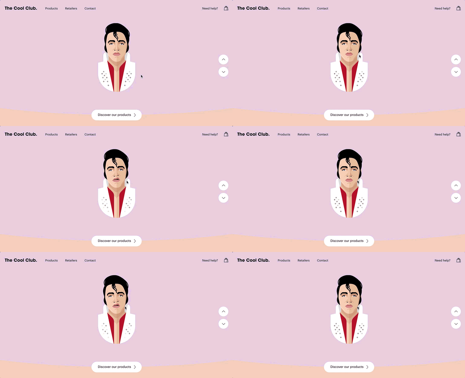
Take, for example, the award-winning site above which implements dozens of micro-animations to draw attention to certain elements, reinforce brand experience and shape how uses interact with the site. (Example: When you click on the characters, they make facial expressions. Or when you hover over the arrows, they change shape.)
2 Parallax Scrolling
One relatively recent web design technique that will continue into 2017 is the use of parallax scrolling, an effect created when the background moves slower than the foreground.
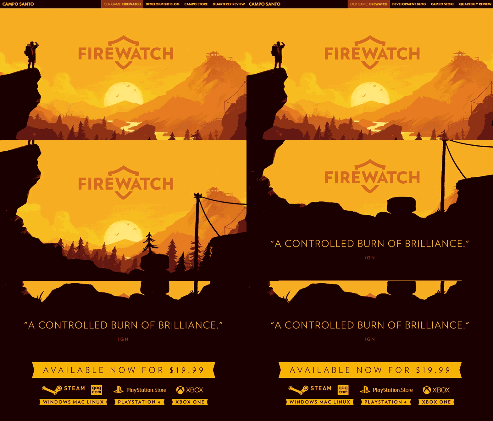
Take a look, for example, at how the site above uses it to create an illusion of depth, without overdoing it and distracting from the main experience.
Other scrolling effects, such as scroll-activated animation, will also play an important role in 2017. It is now more effective to take visitors on a journey through a single page (with conversion as the end point) rather than letting them navigate a site on their own.
3 Interactive Sites
Users are no longer satisfied with being passive recipients of information–they want to interact and engage with sites, much like they do with other humans. In response to this growing demand, we’ll start seeing even more interactive sites in 2017.
A combination of multiple media formats, such as images, video, motion graphics, audio and text, these interactive sites will become better and better at creating a harmonious user experience that seamlessly ties all these elements together.
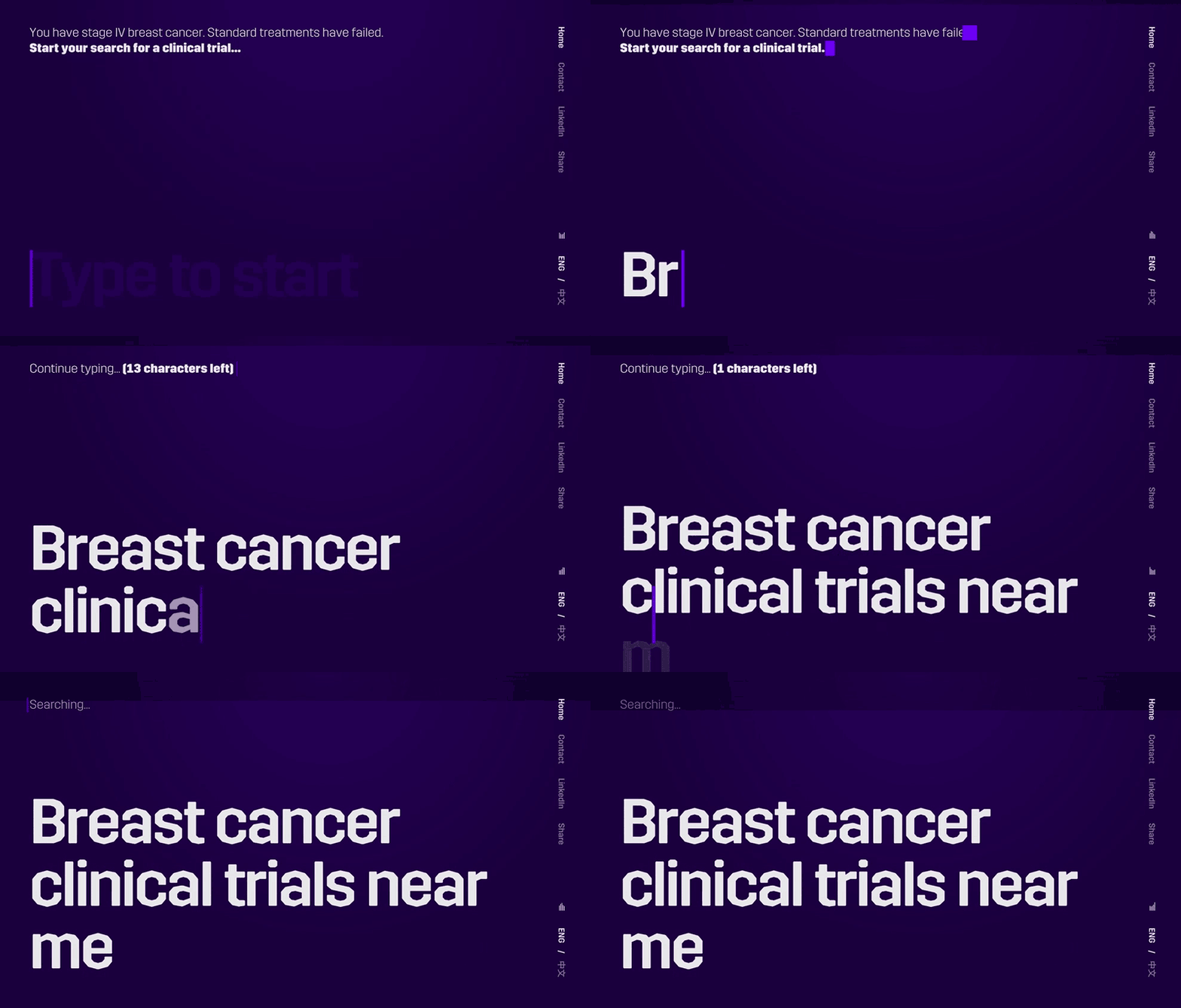
Take a look, for example, at the immersive site above which allows you to see things from the perspective of someone living with cancer.
Or this site, which combines multiple formats in a way that feels natural and doesn’t distract the user from the main message.
4 Voice Recognition
UX expert Noam Alloush predicts that in the next years, voice recognition will transform the way users interact with websites. Although we’re not quite there yet, certain sites are experimenting with audio to increase engagement.
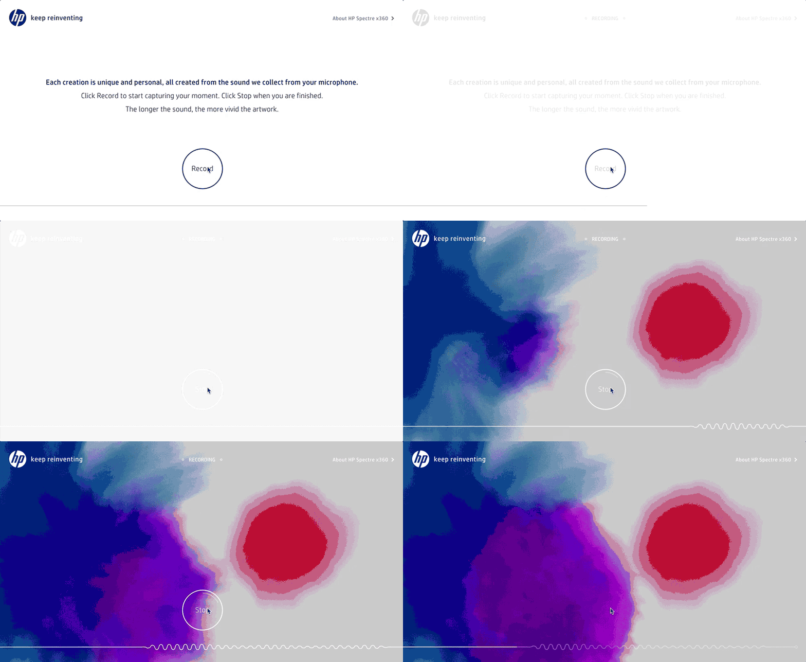
This site by HP, for example, uses the audio from your computer or handheld Android to create artistic visual expressions of sound.
5 Immersive Experiences
As digital experiences begin to move off screen with the mainstreaming of virtual reality and augmented reality, common on-screen experiences will strive to become more immersive, even within the current confines of a box.
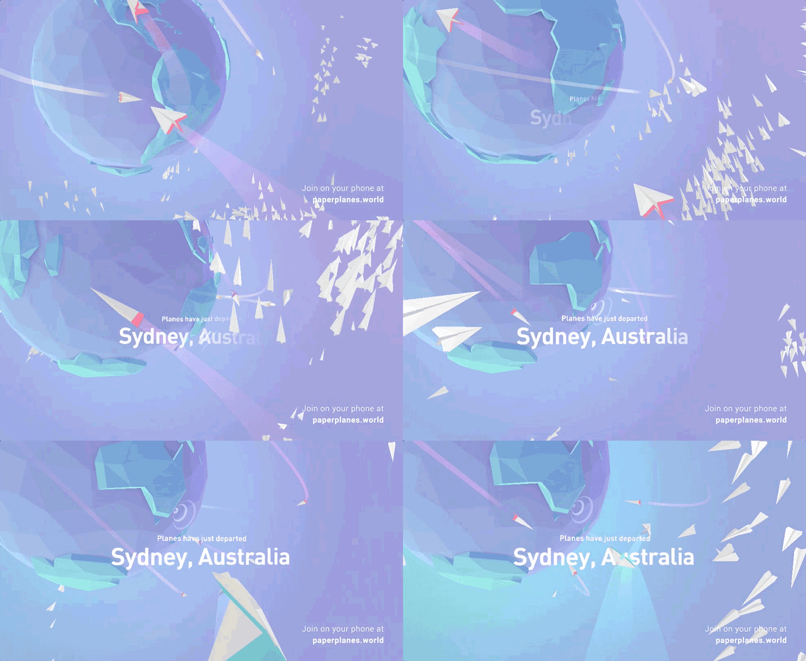
This site, for example, uses three-dimensional geometric shapes and motion graphics to create a beautifully immersive experience.
Or visit this site by Spotify which combines both immersivity and interactivity to create a highly memorable brand experience.
6 Bright Colors
Parallel to the emergence of flat design, the use of bright, vibrant colors has been on the rise and will continue to dominate web design in 2017.
Not only do these vibrant color palettes strengthen brand identity (after all, it’s not easy to forget the bright pink associated with Lyft, for example), they also create contrast and allow other design elements to jump off the page.
7 Animation
According to this analysis, 100% of top, award-winning websites use CSS animations in some way or another.
With the increased capacity of mobile devices, full-blown animations and motion graphics in the first few seconds of a visitor’s interaction with a site are becoming more mainstream. You can also expect to see more cinemagraphs (which are part video, part static) on home pages.
While animations were once just for show, nowadays they also serve a purpose. Here are a few functional advantages to using animations on your site:
- Subtle animation can be used to draw attention to the most important parts of a page, such as CTAs.
- They’re useful for shaping users’ interaction with the site. For example, an animation that makes a menu slide onto the screen when you click on a button creates a smoother experience for the user.
- Animations are a way to communicate that a certain element is interactive, as in the case of hover-over animations.
- Scroll-activated animations guide users through a page and set the pace at which it is navigated.
- Subtle animation in the background adds character and a bit of humanity to your site, making it more engaging and memorable.
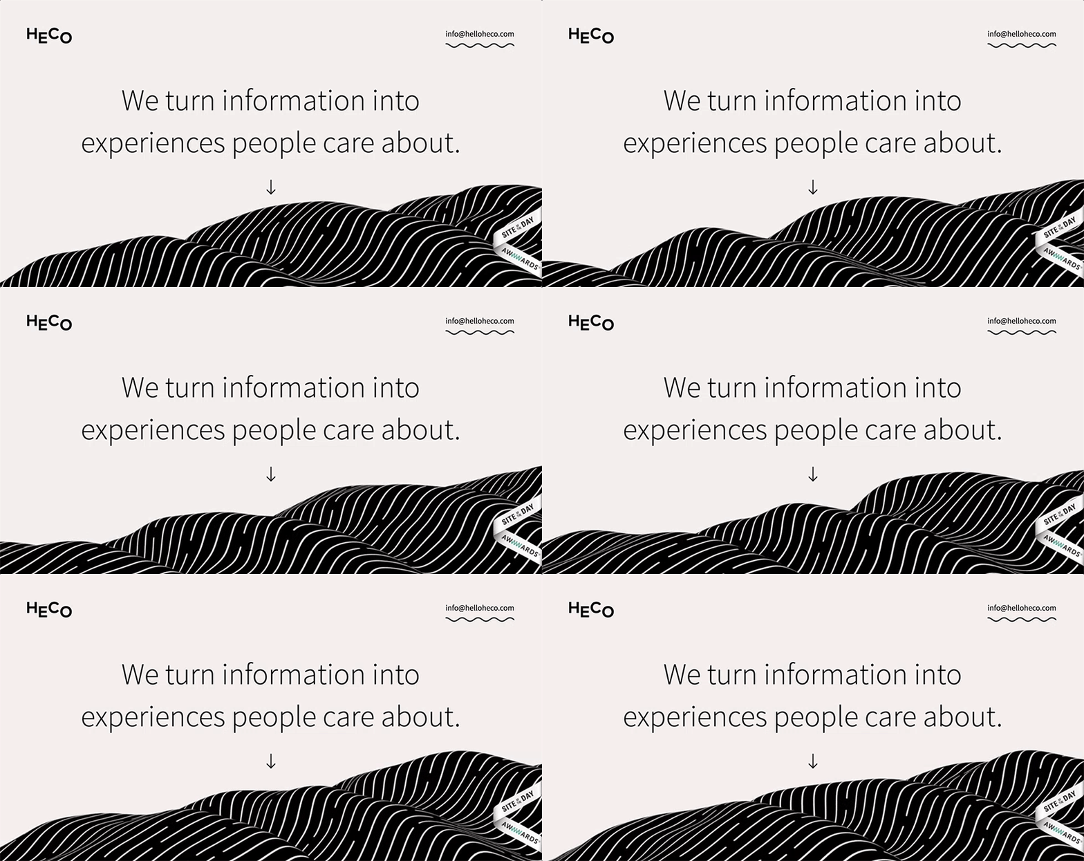
To see how to put this into practice, take a look at how this site immediately commands your attention with this front-and-center animation.
8 Shadows
With the advent of material design, characterized by bright hues and muted backgrounds, the use of deep shadows has also been on the rise.
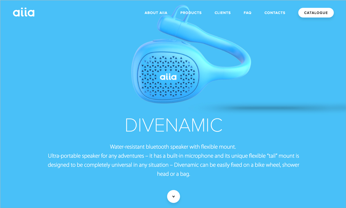
Just take a look at this beautiful home page, which implements nothing more than a solid, vibrant background and the main product, which seems to jump off the page thanks to the use of deep shadows and careful attention to lighting.
9 Fluid Design
The illusion of fluidity is another hot trend that will only increase in popularity with the rise of unified experiences across multiple devices–with the ultimate end goal of completely ditching artificial confines.
For now, the illusion is achieved in our flat, 2D screens through the use of subtle animation, activated by users’ scrolling and clicking actions.
This site, for example, uses animation to create the illusion that all the elements on the page are floating in space.
10 3D Elements
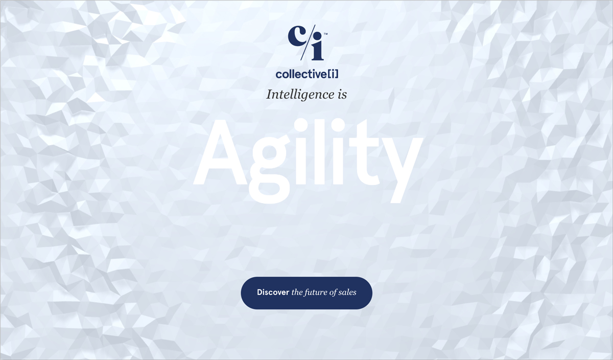
In the last year, flat design has been updated with certain elements that add depth to a page, such as shadows and lighting effects.
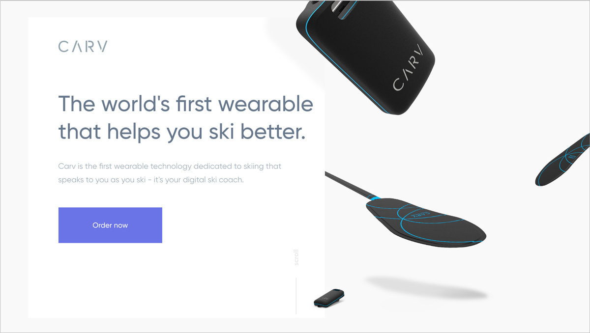
Take a look at this site which uses 3D mono-colored elements, contoured solely through the use of shadows, to catch the eye.
11 Geometric Shapes
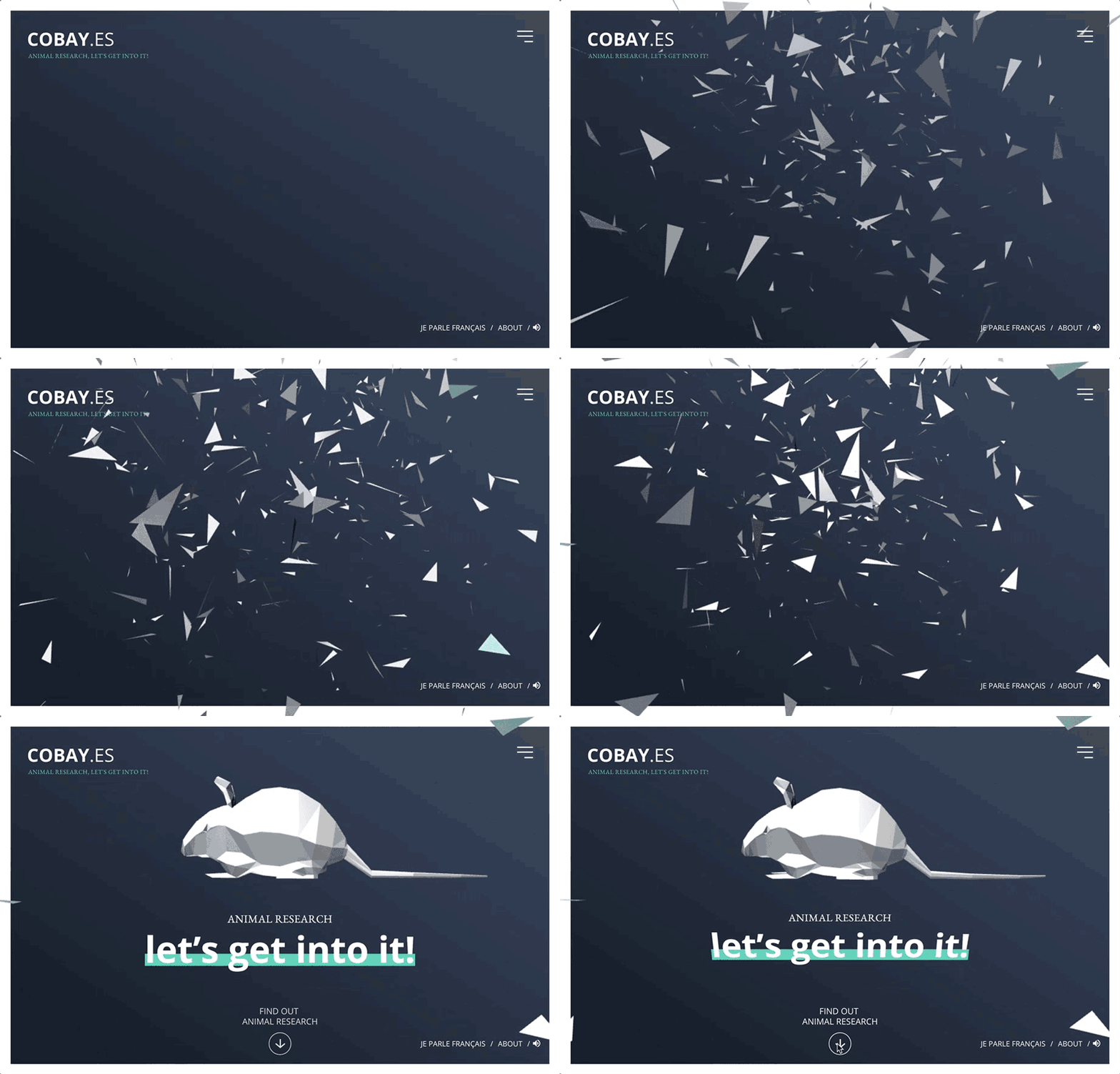
In combination with the previous trends, the use of geometric shapes to create stunning three-dimensional shapes is also a trend that began this year and will continue to influence web design in the coming months.
Known as “low poly,” this technique was originally used in 3D models and computer games and has now found its way into graphic design both for the web and print.
The site above is a perfect example of how this type of design, coupled with engaging motion graphics, jumps off the page and immediately engages the viewer.
12 Typography
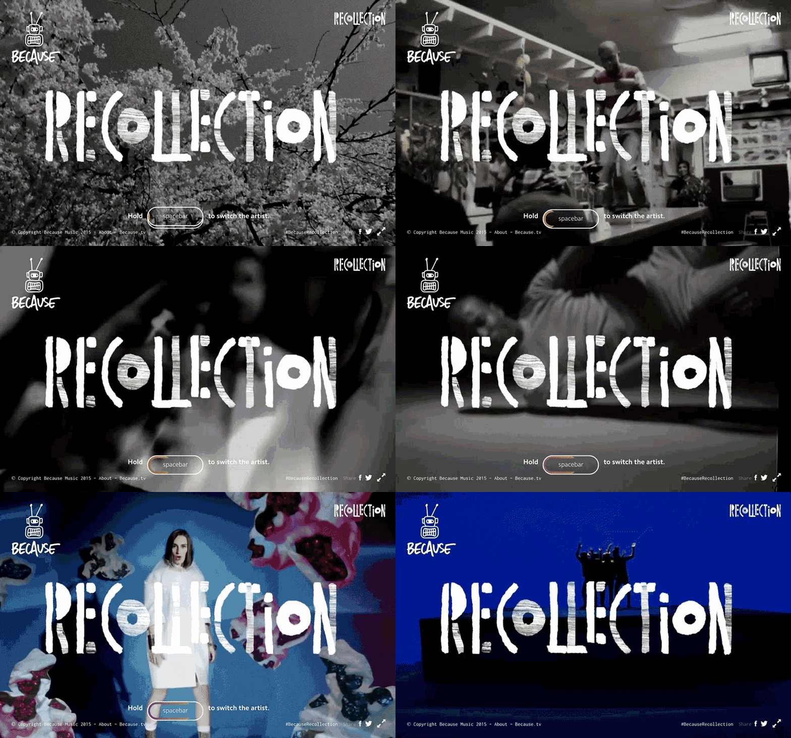
Big and bold typography that takes center stage of a design is becoming increasingly popular. Take a look, for example, at this site which uses custom typography as a central design element on its home page.
13 Gradients
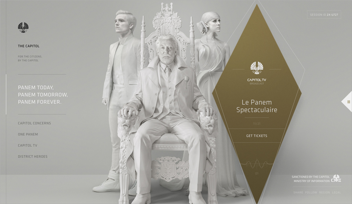
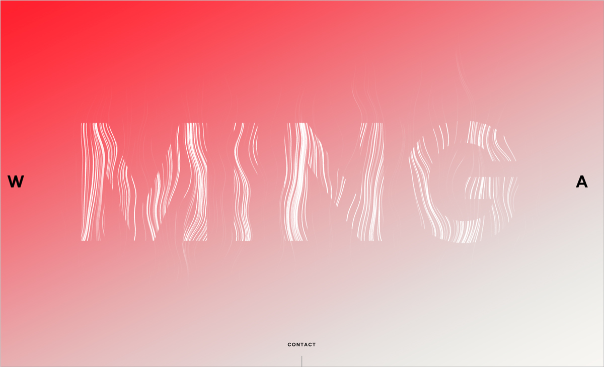
Just like shadows and 3D elements, gradients are making a comeback. Not as garish as some from the web 2.0 era, they tend to be a bit more subtle and stylish.
Take a look at how this applies a red-and-white gradient on its home page.
14 Overlapping Elements
Another way to add depth to a design and make it jump off the page is to use overlapping elements.
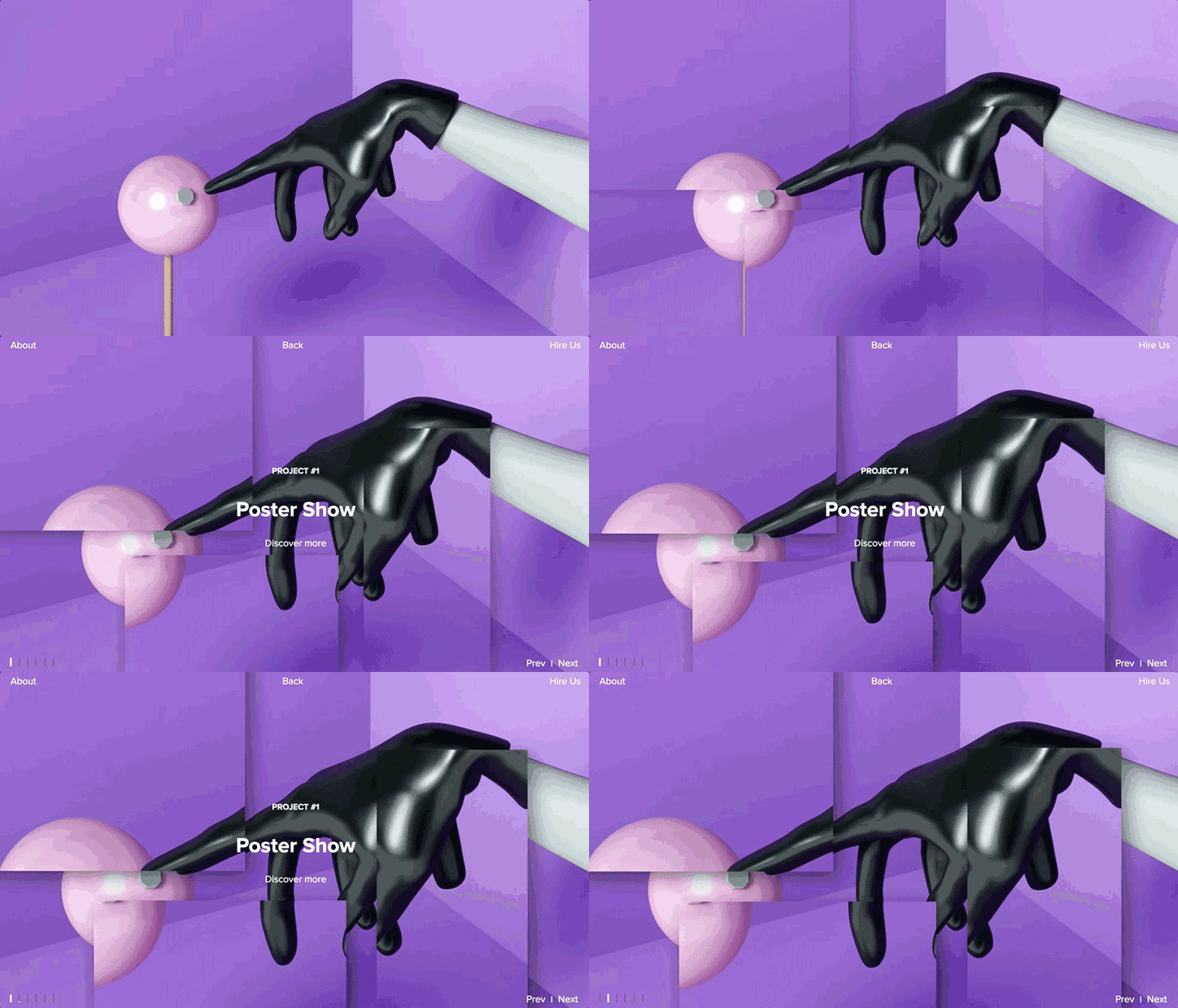
This site deftly uses animation to break up scenes into overlapping fragments that create a 3D effect and the illusion of the scene reaching out to you from within the screen.
15 Illustrations
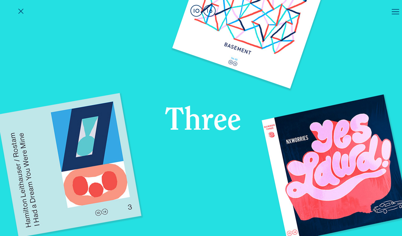
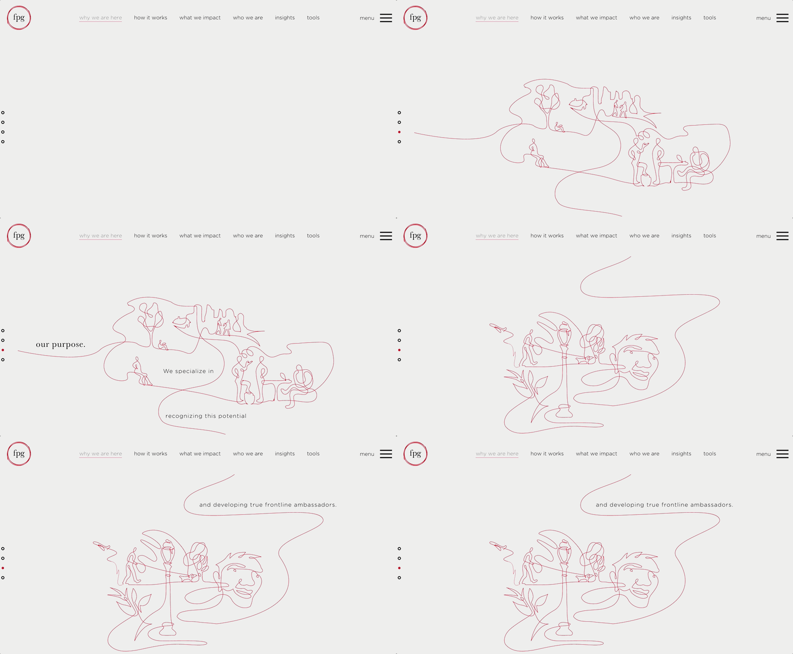
Custom illustrations are another way to catch people’s attention. For example, take a look at this website which uses hand-drawn illustrations on its home page, along with animation to catch first-time visitors’ attention.
16 Animated GIFs
Whether you like it or not, animated GIFs are moving beyond your Facebook and Twitter feeds to mainstream media sites and even websites.
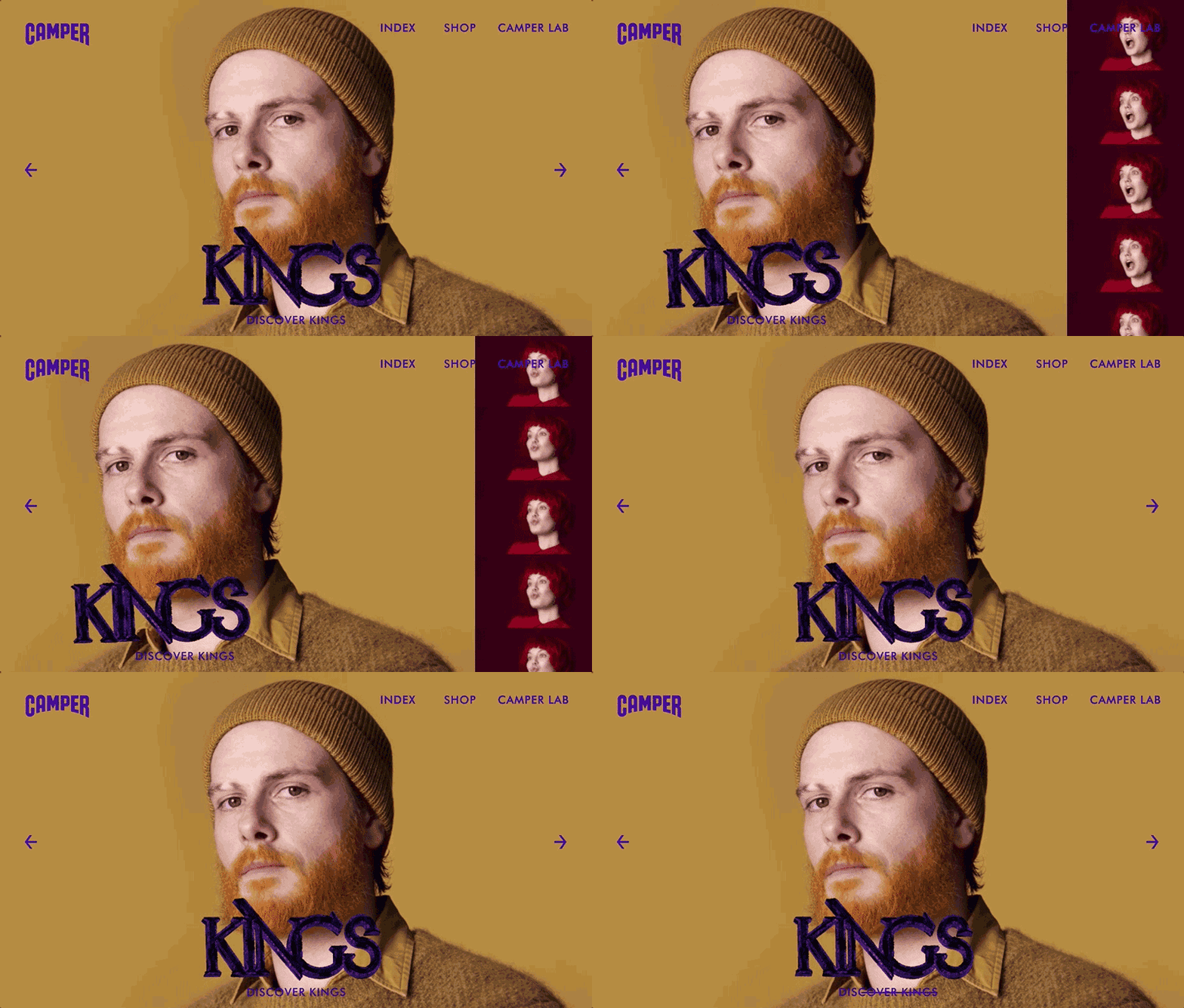
Take a look at how this unconventional shoe brand is using GIFs on its home page to attract its target audience.
Have more questions about websites and how you can update your website design?
Call RLS Group at 904-342-6479
