WordPress Websites
August 4, 2016
Top Ad Agency
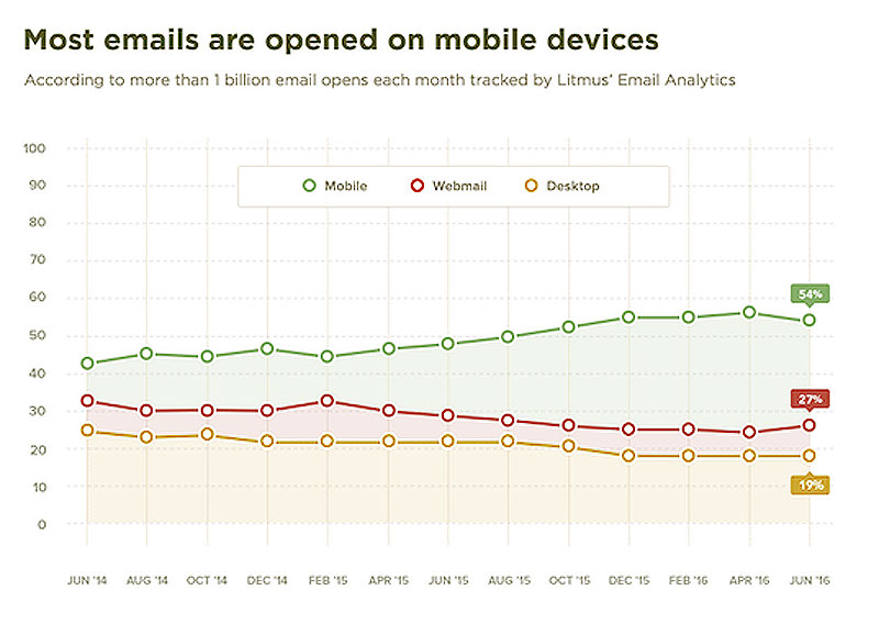
September 8, 2016Email marketing has to be mobile-friendly to be effective as mobile access to the web and email has surpassed desktop.
Embrace the Age of Mobile
In a recent user study performed by Litmus, the majority of email opens happen on mobile devices. Email marketers have now adopted mobile-friendly formats for email design.
Since last April’s decision by Google to penalize non mobile-friendly websites, brands have migrated to responsive websites. As mobile-friendly web content has become the norm, the consumer is now expecting to view content on mobile platforms as well as desktop. Any brand that doesn’t provide compelling user experiences on both risks alienating their prospects and customers.
Is your marketing communications mobile-friendly? Call RLS Group at 904.342.6479 for mobile-friendly email design.
We live in a mobile age and email is the most professional way to communicate directly with your customers, but email may not be reaching its full potential due to many email clients blocking images by default, making it difficult for email marketers to grab attention of their email recipients. Mobile users have lower patience, so landing pages linked from emails are more prone to being ignored or left without any action. These problems can easily be solved by optimizing email templates for both desktop and smartphones.
Mobile usage has reached an all-time high with 23% of Americans checking their email on a smartphone while driving . This trend continues as 97% of individuals owned smart phones in 2021. With email usage on the rise, email marketers are looking for ways to optimize their email campaigns for different email clients and mobile devices.
It has been over a year since the last update of Outlook . It is crucial to make sure your email marketing templates are compatible with this major email client update as it affects over 50% of email senders. According to Litmus, an email marketing software company, 29% of all email being sent today has images blocked by default in Outlook. Email markup language can be used to fix most problems related to images blocking by automatically optimizing every template based on user’s viewing device: desktop or smartphone.
Since many email marketing software programs do not offer email markup language, email template designers should be aware of email clients’ limitations and email marketers need to provide a fallback email version without images. There are many email templates on the market with responsive design options that automatically adapt email layouts depending on user’s viewing device. Using these email design templates can save hours of time for email marketers as they create their own campaigns without having to make adjustments for different devices.
As mobile usage continues to grow , it is crucial that email marketing uses effective techniques in order to attract more customers. Email marketers who use proper email markup language will benefit from increased conversion rates, since emails reach more potential customers by being optimized for email clients that automatically block images by default. These email templates can be used to create email marketing campaigns with an optimized mobile experience, so email marketers and email template designers should make sure they are using proper email markup language or responsive design email templates available for purchase in order for emails to reach their full potential.
Benefits of Mobile Email Marketing
Ecommerce email marketing has two main goals: to increase email subscribers and increase email conversions. With mobile usage on the rise, email marketing campaigns have become easier to access through smartphones, making it easier for email marketers to reach both email subscribers and customers who will actually take action of their email content.
There are many benefits of optimizing email templates for mobile use, including the following:
-Users can check email more frequently throughout the day using their smartphones instead of computers
-With more people accessing email via a smartphone or tablet than ever before, having a responsive design template is very important because it gives users options to view emails based on their viewing device
-Responsive design templates improve open rates by 43% compared to nonresponsive emails
-Responsive email templates have better conversion rates than nonresponsive email templates because they present a more compelling email experience.
– Responsive email design templates can increase email sales by 44% compared to email marketing without any kind of mobile optimization.
These are just a few reasons why responsive email design is so important for email marketers and email template designers. Mobile optimized email campaigns will provide the most engaging experience for customers who view their emails on their smartphones or tablets, which in turn will lead to higher customer satisfaction and increased sales.


